Community Level Poverty Rates
An interactive visualisation of community level poverty rates from the Spatial and Community Dimensions of Income Poverty Report
This interactive visualisation is an extension of the In and Out interactive visualisation that accompanies the Spatial and Community Dimensions of Income Poverty (Payne and Samarage, 2020) report developed as part of the Breaking Down Barriers research series by the Melbourne Institute into understanding and overcoming disadvantage. This interactive visualisation has been created based on analysis, conducted at a community level, using Australian Census data of individuals and households.
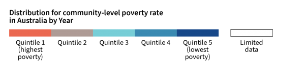
This page visually depicts the quintile for overall poverty rate (See About this visualisation for more information) by year for communities across Australia. Quintile 1 represents the poorest of communities within the distribution while quintile 5 represents the communities with the highest household incomes. The colour scheme represents the overall poverty rate and the values are distributed as follows.
NOTE: For best viewing experience, please view this webpage on a desktop computer using either Mozilla Firefox or Google Chrome.
About this visualisation
For more information about this visualisation including instructions on how to use this visualisation, please click on the button below.
How to use this visualisation
1. Select year of analysis. Select the census year to see the distribution of community-level overall poverty rates across Australia. Analysis was conducted using Census data for census years 2006, 2011 and 2016.
2. Interact with the map. Use the map to zoom in to see a closeup of the spatial distribution of poverty. The mouse pointer can be used to hover over and identify the name of a community. Reset the view of the map by clicking on the Refresh page option in your web browser.
Methodology
This interactive visualisation is an extension of the analyses and data in Payne and Samarage (2020, Spatial and Community Dimensions of Income Poverty), a report for the Breaking Down Barriers research series into understanding and overcoming disadvantage being undertaken by the Melbourne Institute. This report analyses cross-sectional data from the Australian Census of Population and Housing (ABS) for census years 2006, 2011 and 2016. Aggregate data at a community level were analysed to derived localised poverty rates for all of Australia. This visualisation shows overall poverty i.e. households where the household income is less than 60% of the median household equivalised income. Communities are classified by their ranking in the distribution of communities according to households in poverty within a community. Aggregate income data for households with single persons, single-parent families, couples with and without children were considered in the analysis. Communities depicted with no color denote communities that were removed from analysis due to limited data/counts. For more information on the data and subsequent analyses, please refer to the report cited above.
Breaking Down Barriers
Breaking Down Barriers is a research series into understanding and overcoming disadvantage being undertaken by the Melbourne Institute. For more information please visit Breaking Down Barriers.
Disclaimer
© Copyright 2020 Melbourne Institute: Applied Economic & Social Research, The University of Melbourne. Data preparation, analytics and interactive visualisation provided by MI staff and the MI Data & Analytics team.